
Let's talk design systems
Streamlined Design Systems Built for Scale and Consistency
Create powerful, scalable design systems in Figma that evolve with your brand—ensuring consistency, speed, and collaboration across teams


A design system is like a set of LEGO bricks for digital products. Just as LEGO provides standardized pieces that snap together to build countless complex structures, a design system offers reusable building blocks for creating websites and apps. These components ensure everything fits together seamlessly and maintains consistency, no matter how you assemble them

Speed up your design
Accelerate your design process with reusable components, you'll build and iterate prototypes in record time.
Adaptability Future-proof your designs
As your brand evolves, updating your design system in Figma automatically refreshes all linked projects.
Seamless Collaboration
Foster team synergy. Figma's cloud-based platform allows real-time collaboration, keeping everyone on the same page.
Version Control
Track changes effortlessly. Design systems in Figma make it easy to manage updates and roll back when needed.
Streamline developer handoff
Figma's design systems provide clear specifications, reducing miscommunication and speeding up development.
Consistency at Scale
Maintain brand integrity across all products effortlessly. Design systems ensure every element aligns with your visual language.


Why figma
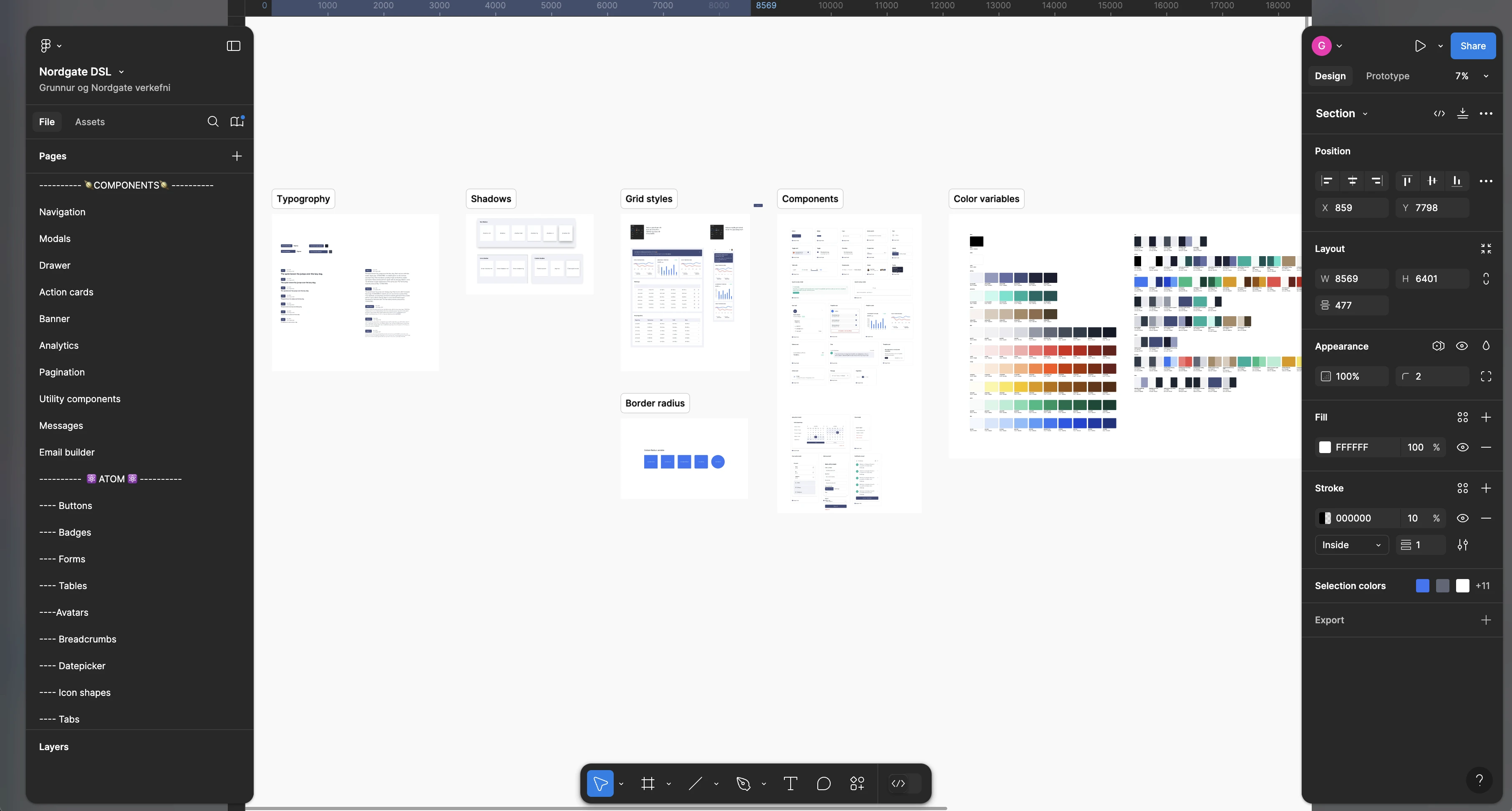
Think of it like a library
Where everything—from buttons and icons to color schemes and typography—is stored neatly in one place, ready to be used across all your projects. It’s a powerful tool because it gives your team a single source of truth.
When you need to create something new, you can pull from this library rather than starting from scratch every time. But here’s the best part: a design system isn’t static. It’s a living, breathing library you can build for the future.
As your brand evolves or new projects come up, you can add new components, update existing ones, and keep everything aligned across teams and projects. It helps ensure that no matter who is working on a design, they’re always using the most up-to-date assets, making your workflow more efficient and your designs more consistent.
In simple terms, it's the foundation for your digital design work—both for today and tomorrow.
Discovery & Audit
The first step is understanding the current state of your design assets and processes. We conduct a detailed audit of your existing UI components, branding guidelines, and workflows. This helps us identify what’s working and where we can introduce improvements
Key Outcome: A clear assessment of existing assets and opportunities for streamlining the design process.
Foundation & Variables
In this step, we create a comprehensive style guide that serves as the backbone of your design system, and integrating all key visual and interactive elements in a cohesive structure. Here’s how we approach it:
Typography & Grids
I define a responsive typography scale in variables and a grid system tailored to desktop, tablet, and mobile. This ensures that text, spacing, and layout remain consistent and adaptable across different screen sizes.
Variables & Breakpoints
Variables for breakpoints and string (desktop, tablet, mobile) are set to ensure seamless behavior across devices. These breakpoints, along with the grid and spacing system, provide a flexible foundation for responsive design.
Primitive color collections
I define your primitive colors, including brand, accent, and feedback colors, as the core palette. These foundational colors are critical for maintaining brand identity across all platforms.
Semantic Color Variables
We establish meaningful aliases that map to specific roles within your design system—such as surface backgrounds, text colors, and interactive states. This ensures that color usage is logical and consistent, both for designers and developers.
Icon & Assets Librarys
I build organized icon and asset libraries, providing easy access to all visual elements. This centralizes your digital assets for consistent use across projects
Dark Mode & Theme Variability
If applicable, we implement dark mode or other theme variations, ensuring your system is ready for diverse use cases without sacrificing design integrity.
Advanced Variables
Recent advancements in design tools, especially Figma, have opened a new world of possibilities. We leverage design variables to mirror development structures, using standardized naming conventions that make the design-to-development handoff smoother and more efficient. This enables faster iteration cycles and deeper integration with code.


Building the Essential Blocks
Once I have a strong foundation, I create or refine the core components that will form the building blocks of your design system. This includes everything from buttons and forms to navigation and typography.
Why This Matters: By designing reusable components, we ensure consistency across all platforms and reduce the time spent recreating elements.
Example: We’ll create a button component that can be used across multiple projects, with variants for different styles or uses, ensuring consistency in design and functionality.
Documentation & Handoff
A great design system is only as effective as its documentation. We make sure your system is well-documented so that everyone, from designers to developers, can follow the same guidelines.
What We Provide: Clear, step-by-step documentation that explains how to use the system, implement components, and maintain consistency across projects.
Smooth Handoff: Whether it’s developers building the product or designers updating the interface, the handoff is seamless thanks to clear guidance.

Keeping Your System Evolving
A design system is never “finished.” As your brand evolves, I provide ongoing support to ensure that your system grows with it. We regularly review and update your design system to match your brand’s growth and technological changes.
Continuous Improvement: We’re here to help refine, expand, and maintain your system as your needs evolve.

Got Questions About Design Systems? We're Here to Help
We specialize in audits, updates, and hands-on workshops to help your team master design systems—from setting up variables to creating scalable components. Whether you're building from scratch or refining an existing system, we ensure your design system is solid, scalable, and future-proof.


